Breakdown Tab
Breakdown Tab
#38xxx
This page summarizes the content as a breakdown of the items, selected in the tree view. For example, if you have the entire environment selected, the breakdown for clusters, namespaces, pods and containers is listed. If you have namespace selected, then you will see the breakdown by pods.
A summary banner is displayed at the top of page to highlight the status and scope of systems that are included in the breakdown chart.
Figure: Breakdown by <Type>
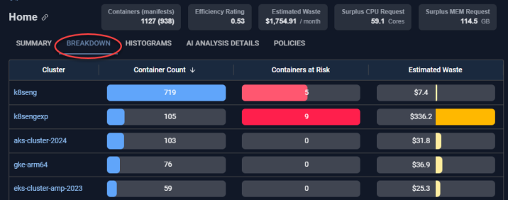
The following values are displayed for each item in the list:
- Container Count—The number of containers in the selected scope.
- Containers at Risk—The number of containers in the selected scope, that are at risk due to resources being under-allocated. The colour of bar indicates the severity of the issue.
- Estimated waste—The wasted resources, in the selected scope, converted to dollars. A negative value indicates more resources are required to avoid performance issues.
Note: The value here is the number of containers and will not match the tree viewer that shows the number of manifests.
Environments can have both over- and under-allocated systems. The Histogram tab helps you identify these situations and you can then use the AI Analysis Details tab to identify and correct individual containers.
Drill-Down Hyperlinks
You can click the hyperlinks in the first column to drill down to its contained elements. As you drill down, the tree viewer, column header and breadcrumbs update to show your relative location.
When you reach a single container, the detailed Overview and the Metrics Viewer tabs are displayed, providing the tools for more detailed investigation.
Reading the Bar Chart
Each bar in this table is sized based on the highest value within its own column— rather than the total of all selected items (i.e. clusters, or container, etc.). As an example, in the figure above:
- In the first column ("Containers"), the cluster k8seng has the most containers (719). So, it is shown as 100%, and all other clusters are displayed as a percentage of that number.
- In the second column ("Containers at Risk"), k8sengexp has the highest count (9), making it 100% for this column. The other clusters are scaled accordingly.
- In the third column ("Cost"), again, k8sengexp has the highest cost ($336.20), so it is shown as 100%, and the rest are shown as a percentage of that value.
This way, each column uses its own highest value as the baseline for comparison.